
Exterior House Colors: Build a Palette Around What Stays
Consider your roof, masonry, trim and front door together to create an exterior color palette you can compare on your own photo.
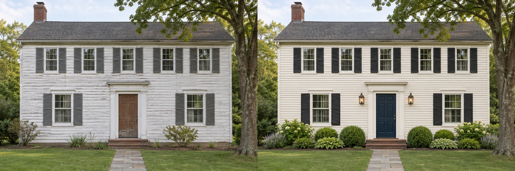
Exterior house colors work as a group. A wall color that looks appealing on a screen can feel different beside your roof, stone, brick or window frames. Start by identifying those fixed elements, then explore a small number of complete palettes.
Read the existing colors first
Take a photo in reasonably even daylight. Look at the largest surfaces and describe them in simple terms: warm brown roof, cool gray stone, cream window frames or red brick with dark joints. This is more useful than trying to identify an exact paint code from a photo.
Pay attention to undertones. A white that looks neutral on its own may read blue beside warm brick, while a beige may look pink next to gray stone. Compare candidate colors against the finishes that will remain on your home.
Assign each color a job
A simple palette can give the main wall finish, trim and front door different roles. The largest surface sets the overall mood. Trim can connect openings or make them more pronounced. The front door can provide a focused accent.
You do not need a different color for every element. Repeating a trim color across windows and porch details can make a varied facade feel calmer. A single stronger color near the entrance may be enough to give the composition a focal point.
Compare directions, then refine
Begin with three clearly different approaches:
- A warm, light body color with quiet trim.
- A more tonal palette, with less contrast between walls and trim.
- A stronger contrast that emphasizes openings or the entrance.
Keep the same original photo for each version. Comparing whole palettes is easier when viewpoint, planting and lighting remain as consistent as possible. Once you choose a direction, make smaller adjustments to individual colors.
Use a preview for relationships, not paint matching
In the HouseExterior studio, describe the colors you want to explore in everyday words. For example: “Warm ivory siding, soft white trim and a muted blue door. Keep the roof and existing brick.” Your selected style adds a broader direction, while the instructions make the idea more specific.
For the entrance alone, the front door color tool lets you mark the door and compare colors locally. That is a useful way to test an accent without asking for a whole-house redesign.
Screens, camera settings and generated lighting all affect apparent color. A preview cannot guarantee a match to a named paint, a finish or a manufacturer's sample. Avoid using a sampled screen color as your final purchasing specification.
Check your shortlist outdoors
Review physical samples beside the actual roof, trim and masonry. Look at them from the street and close to the entrance, in the lighting conditions your home experiences. Confirm the finish and surface preparation with your supplier or contractor.
Save the comparison that explains your preferred relationships: a lighter wall, a quieter trim, or a door that stands out. Then use real samples to choose the specific products.
See how color fits into a broader curb appeal plan, or explore the role of siding texture and layout.
Keep exploring.
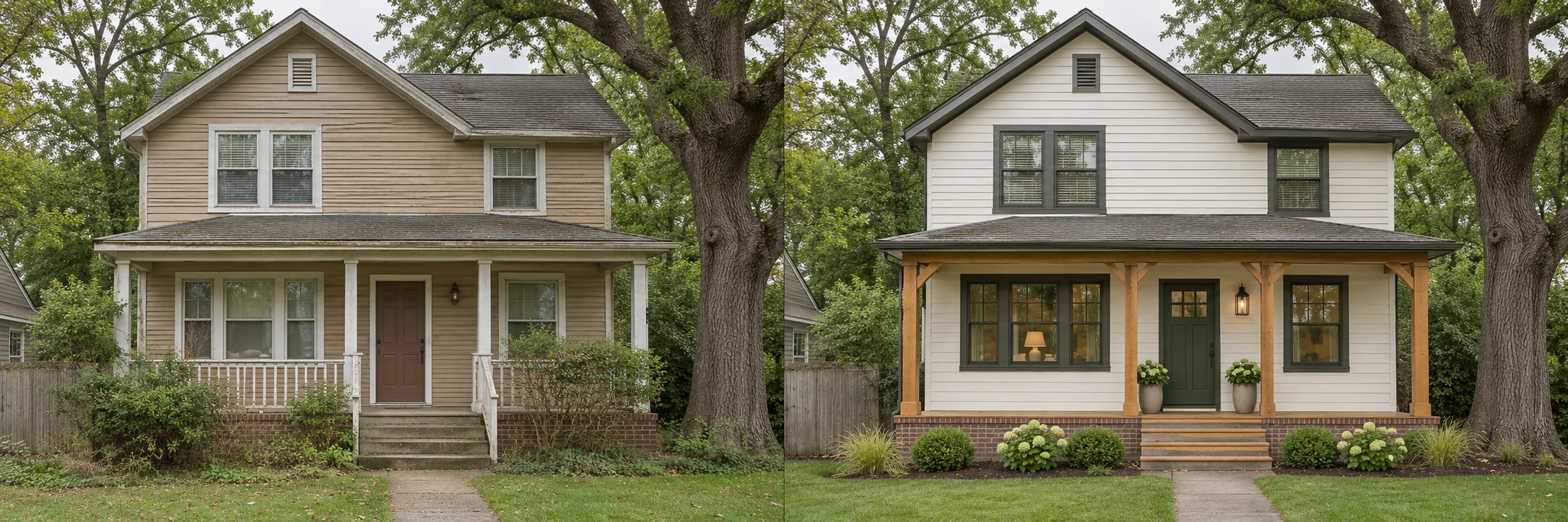
Curb Appeal Ideas That Start with Your Own Home
Find a clear direction for your exterior by considering the entrance, existing materials and a few focused changes together.

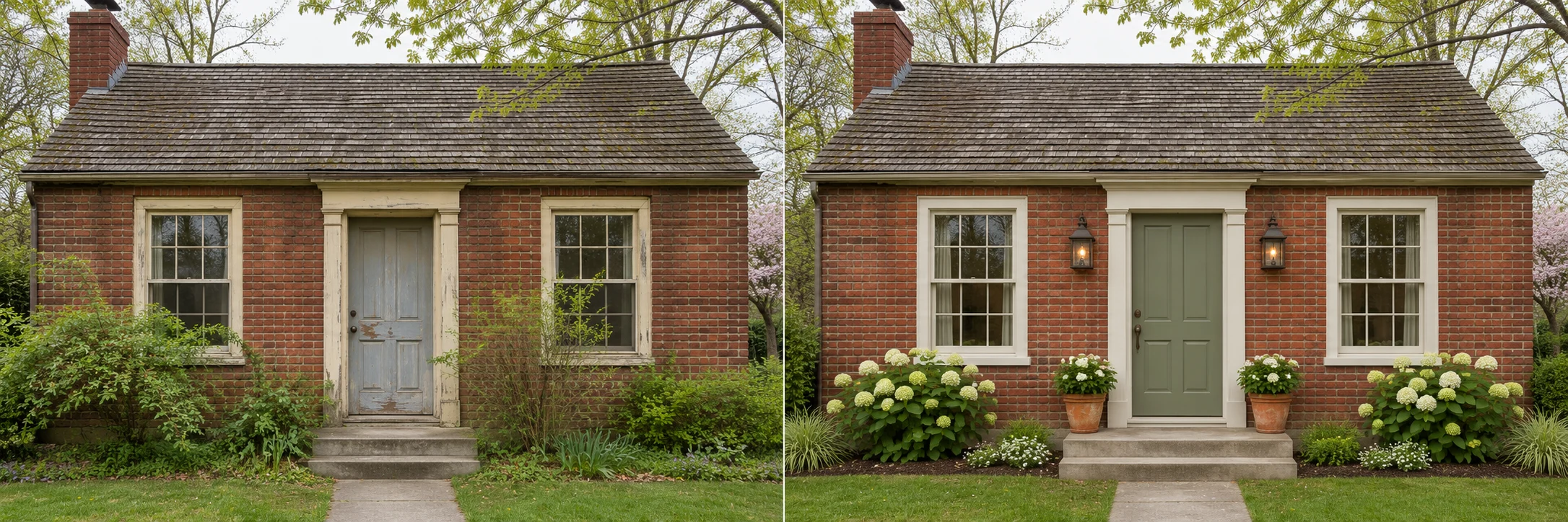
House Siding: Compare Color, Texture and Layout
Explore how siding changes the appearance of your home, while keeping visual ideas separate from material and installation decisions.